When Nintendo reimagines a game, they make sure that every bit of the experience gets a redesign, while still remaining faithful to the original game.
This is also true for parts of the game that may not be as apparent, such as the item screen and map in Link’s Awakening on Nintendo Switch.
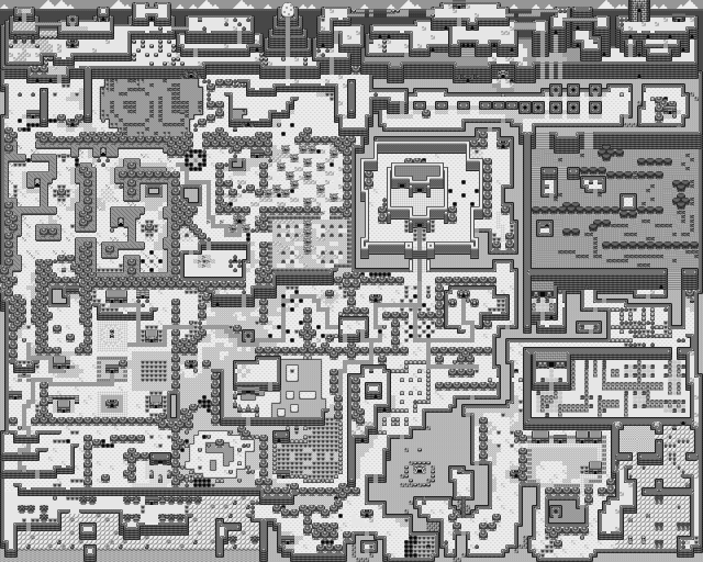
 The original map, made up of a series of small glyphs on a grid, formed a grand overworld that started to look like a proper map once more of the pieces fell into place. Navigating the grid was a square cursor that showed a small preview of what was in that area.
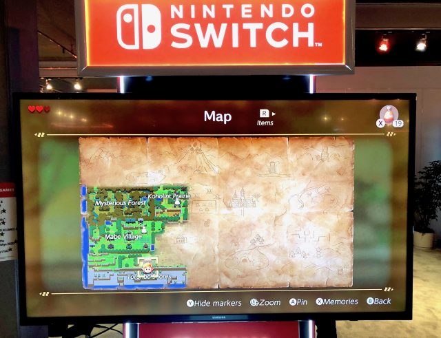
Nintendo has updated the map itself with a more painterly style, with actual brushstrokes revealing parts of the world that have been visited since the last time the map was opened. In fact, if you wait until the end of the game before you even open the map, the entire thing will reveal itself in spectacular, painted fashion.
Until we have that content, though (the demo at E3 was only 15 minutes, and we’re not skilled enough speedrunners to even attempt to start pause buffering through objects), it looks like we will only be able to see what the beginning part of the map looks like:

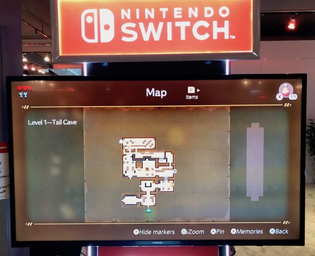
The other map we can expect to see on Link’s quest is, of course, the dungeon map. Here, we have the map for the Tail Cave, the first in the game, only partially revealed.

Expect to see more of the game as Nintendo likely releases a bit more content leading up to it’s launch later this year.
Link’s Awakening arrives on Nintendo Switch on September 20, 2019.

