The leaked tablet controller has made its rounds. So what do we think?
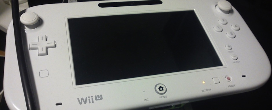
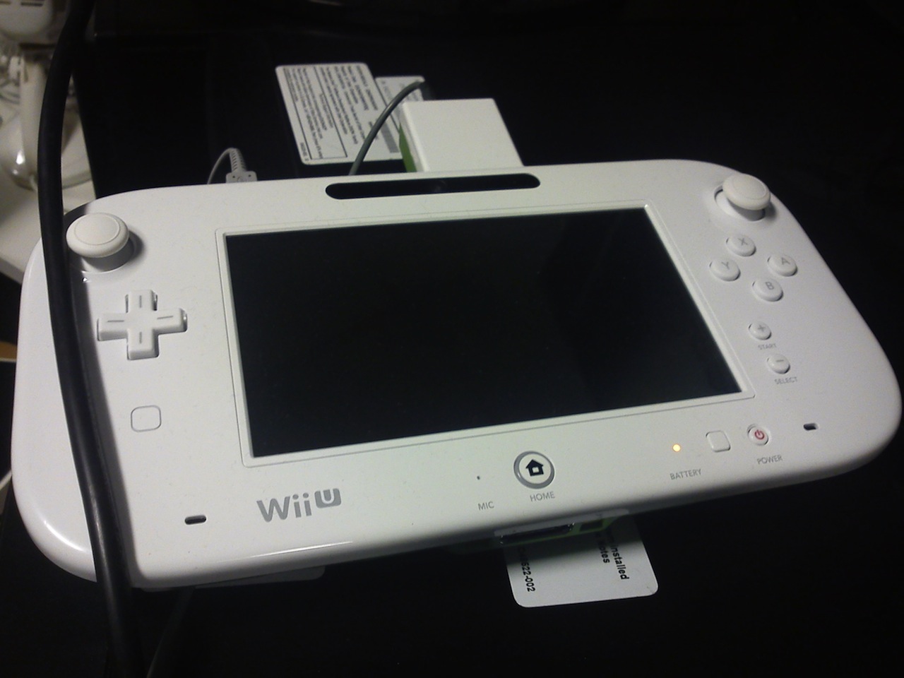
Yesterday, a Quality Assurance Tester from Tt Games, developers of the LEGO Star Wars and LEGO Harry Potter games, among others, posted the following image on his Twitter account, stating “look what we have at work!” The tweet itself has since been removed, but the photo attached to it is the big thing here.
So, now that you understand just what the heck we’re talking about, there’s some discussion to be had. Not only is this a Wii U Tablet Controller (supposedly), but it’s wildly different from the one we saw at E3 last year. There are a few major things we can glean from the image, so let’s get started.
- Wii U is the final console name. While this tablet is clearly a developers kit (that giant plastic thing sticking out of the top seems to give that away all on its own), Nintendo didn’t have the name printed on the controller last year at E3, signalling that they might not have been completely sold on it. However, with these units making their way into the wild, Nintendo seems to be sticking to their guns. We’ve only got another 16 days before the official name unveiling alongside pricing, dates, and launch line-up is revealed, so we’re pretty confident in saying that you should start getting used to the Wii U name, ’cause it ain’t changing’.
- The docking port isn’t for power. At least on this developer unit, it doesn’t appear that the bottom ports are used for charging. The grey cable sticking out at the top of the unit looks identical to the 3DS charging cable, so we’re almost positive that the bottom dock will be used only for accessories like the updated Zapper we saw in the original Wii U promotional video. Of course, it could be that either or would be used for charging if Nintendo releases a dock-like peripheral for the Wii U Tablet, but we’re not entirely sure yet.
- Ring of light around the home button. Hmm, now where have we seen that before?
- New buttons. There is a little square below the d-pad on the left side, and it appears to be flush with the surface of the controller. If this weren’t a touch screen controller, we’d automatically assume it was some sort of touch sensitive button of sorts, or perhaps the location of a magnet to attach something like an external arcade stick by sitting it right on the front of the controller. But with that massive touchscreen, we’re not sure what we’re looking at, to be honest. Sure, it might still be a touch-sensitive button that is thumb-reachable at the same time you’re using the d-pad or analog stick, but we’ll have to wait and see what happens in Los Angeles.
- Analog sticks instead of circle pads. We kind of like circle pads, actually. No, they’re not the most ideal, but they’re more streamlined and don’t look butt-ugly like the analog sticks to jutting out of this abomination above. But hey, analog sticks provide more realistic motion than circle pads, so we see why they’ve made the change here. Does it mean we’ll see analog sticks on the 3DS anytime soon? Probably not, but who knows.
- Much curvier bezel. We loved the design of the original Wii U Tablet Controller. Really. It blew us away, even. We held it and it was this incredible piece of technology in our hands. But it wasn’t this curvy; it was a svelte piece of square-yet-round peripheral. The bezel on this redesigned controller is a lot rounder and while it likely changes nothing regarding functionality, it looks more like a toy now than it did before. And that’t not a good thing.
- What about the console? We’re seeing a pretty massive redesign here with the new tablet controller, but it makes us wonder if we’re going to see anything like this happen to the console itself. We already think there will be a 3DS cartridge slot on the front of the console, but will anything else be revealed about the console before its launch this holiday season? Probably not, but who knows.
We know a lot of people are wondering what that square button is next to the power button. We’re pretty certain that is just a sync button. It’s likely a small function since it sits between the battery light and power button. It may also be to turn off the tablet display to save battery life if you’re playing a WiiWare download that needs a Classic Controller, for example, where having the screen on might not be necessary.
So our overall thoughts? Well, it’s nice to see something’ fresh since the last we saw of the Wii U was at last year’s E3. But we’re not actually fans of this big redesign. It is pretty clear to us that this image is in fact real and it is likely that this controller is the final redesign. But until we play with it in the flesh, we’re going to say that we prefer the original. We’ll take the analog sticks, of course, but the rest of the changes can go pound sand if you ask us.
We really wish Nintendo would put a bit more thought into the final finish of the device. The round bezel makes the tablet look too toy-like. The battery light could easily be moved to the top or bottom edge in the name of having a cleaner front face of the controller. In fact, the power and sync buttons can go to the edge, too, and the microphone divot should be built-in to the sensor bar on the top of the controller where it would be invisible. Do those things and you’ll have a much cleaner design that will appeal to all and not be such a busy eyesore.
Nintendo knows how much we love them, and the Wii U is certainly a favourite to come out of the company in a long while, but here’s hoping the original tablet controller sees the light of day before this abomination.


