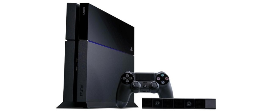
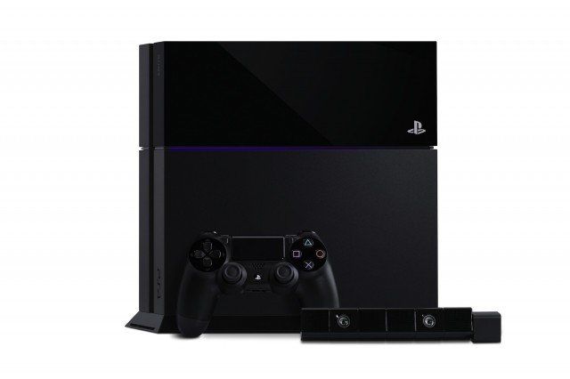
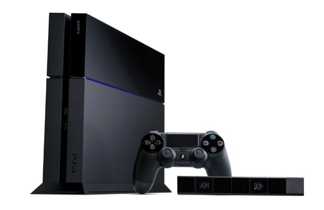
 Sony unveiled the long-awaited design of their PlayStation 4 at the press conference on Monday evening. We like the new design a bit more than the Xbox One, but that is for another day.
Overall, the console appears a bit smaller than the original PlayStation 3, while the DualShock 4 controller is about the same size as its predecessor. The PlayStation 4 Eye is remarkably small, at about the same width as the DualShock 4, and about half its height.
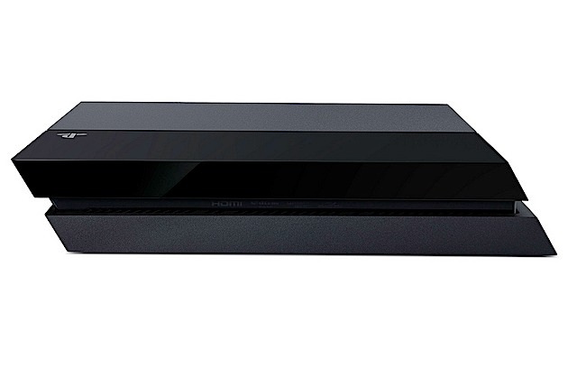
The design of the console itself is angular in nature, looking like an old classroom eraser from its side. That’s an odd comparison, but it shouldn’t take away from the beauty of the unit, as it is very much a svelte and well-designed piece of machinery. The system lights up with a thing glowing blue beam near its top half where it splits into different levels of matte and gloss black plastic, much like the Xbox One.
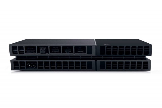
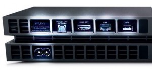 The ports around the back each seem to be relegated to their own vent-like cavern which helped Sony keep a uniform look to the back. We think it looks a bit like a fighter jet’s engine exhaust, and that’s never a bad thing.
Update: To the right is a photo with each port highlighted for better visibility. You can see the AC adapter on the bottom, along with (from left to right) a PS4 logo, optical audio out, HDMI out, ethernet-based LAN, and an AUX port for the PlayStation 4 Eye. There are two USB 3.0 ports on the front of the PlayStation 4 as well.
Take a look at the gallery of press shots below, and we’ll have our impressions of the machine from E3 within the next few days as we get our eyes and hands on everything PlayStation 4. In the meantime, let us know what you think about the design on Facebook and Twitter!

