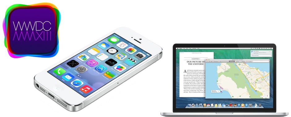
 At its annual WWDC conference, Apple announced updates to its two operating systems, iOS and OS X.
The update to their desktop and laptop offering, OS X, included a new naming system that highlights the areas around the company’s home state of California. The first version of this release is OS X 10.9 Mavericks, named for a surfing location off the coast of the Western State.
The update to their mobile offering is iOS 7, the biggest redesign of their mobile operating system since the launch of the iPhone back in 2007. Of course, Jony Ive took the lead on the design and things are radically different.
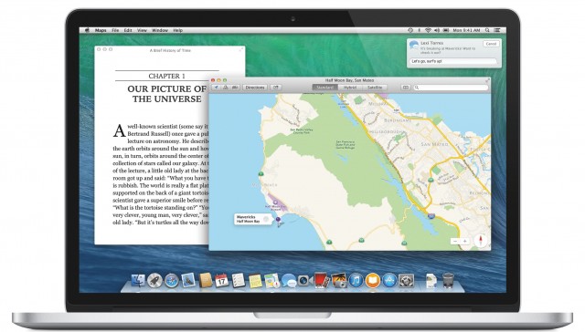
On the OS X front, Apple unveiled a lot of new features including better support for multiple displays, tagging support, and crowd-favourite Finder tabs. In addition, Apple is bringing Maps and iBooks over from their mobile operating system to the Mac at a system integrated level. This makes it very easy to find directions on your computer, for example, and the software can even sync that map with your phone for easy retrieval when you get on the road.
 It appears as though every app in OS X Mavericks has also been redesigned with a much more flat appearance and a move away from Scott Forstall’s love for skeuomorphism. The calendar no longer has stitching, Top Sites in Safari are no longer shown in a curved display, and notification center has been given a few upgrades of its own.
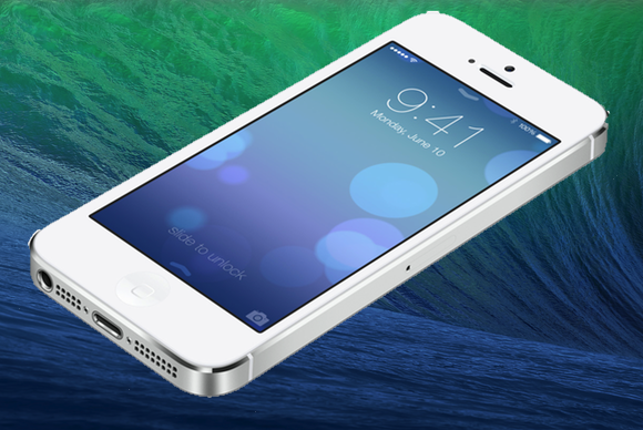
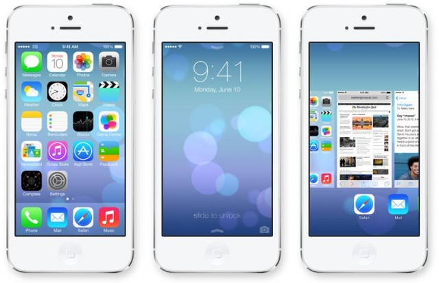
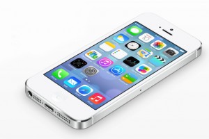
Moving to iOS 7, Apple showed off everything from a new lock screen to new icons for every app, as well as a redesign in every app on the iPhone. iOS 7 really is a massive overhaul, and while a lot of people are calling it an incremental change, there are a lot of new and beautiful features that make it easy to use. The more we look at it, the more we love it.
The new Control Center is activated with a swipe up from the bottom of the screen and is a panel that lets you quickly access switches for WiFi, screen brightness, rotation lock, and airplane mode, among other things like alarms, your calculator, and camera. There is no more multitasking tray at the bottom of the screen as that has been removed, so you’ll also be able to adjust your music from Control Center.
 Speaking of redesigned multitasking, the menu now gives you a live preview of whatever is going on in your application. You can swipe up to close an app, but it doesn’t look like there is a way to close every app.
Photos, along with a new icon, got a major overhaul, that organizes everything by date, rather than in a single, ever-streaming camera roll. The camera app itself also got a slight update, but no new features were added.
Safari, Siri, Notification Center, Messages, and Mail have all been redesigned with a very white and blue interface that seems to be very clean and unobtrusive. There are layers of blur everywhere when you pull a panel over a screen, so that it shows your content underneath with just a slight hint of what it is, to give the appearance of layers.
There are a ton of other announcements from WWDC, each of which we’ll be going over in more detail in the coming weeks and months as we get the chance to play around with the various software and hardware that was announced. Until then, you can grab all your Apple news on their website, or discuss it with us on Twitter or on Facebook!

