I’m writing this review as I wait for my next race in WipEout 2048 to load. Alright, so I’m exaggerating a slight gripe with the game, but truthfully, that’s one of the very few that I have, so don’t let that line taint your opinion of Studio Liverpool’s latest title.
WipEout has long been the epitome of arcade racers. Let’s face it, many have come before it (namely, the F-Zero series from Nintendo), but they haven’t been nearly as successful. Now, with F-Zero having nearly a decade since its last release and Sony launching their latest technology in the form of the PlayStation Vita, it only seemed fitting that a new Wipeout game was released. Enter WipEout 2048.
I’ve made a few pretty bold statements in my latest game reviews, so why stop now?
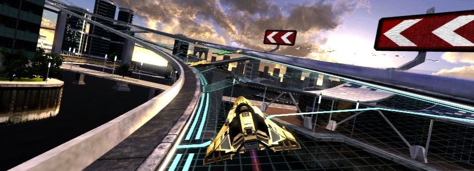
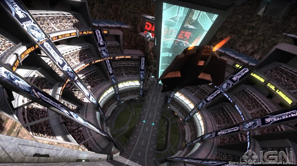
WipEout 2048 is the best looking racing game I’ve ever played. On any system.
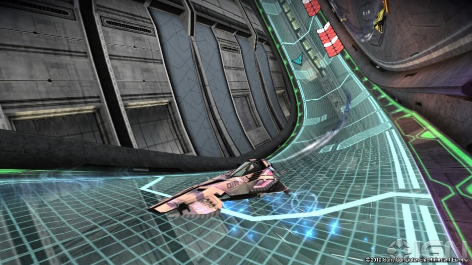
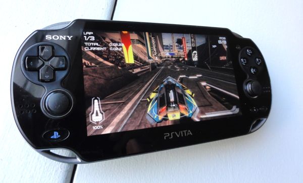
Now, take that statement with a really tiny (minuscule, even) grain of salt as 2048 is on a portable console, after all, but my goodness is this thing beautiful. And not only beautiful, but it plays as smooth as a hot knife going through melted butter (read: real smooth). Unfortunately, while the screenshots are good, they don’t do any sort of justice for the game. I’ve added a few, but they’re really about 50% of the quality that you can expect with the Vita’s beautiful display over your computer monitor, no matter how good you think it is.
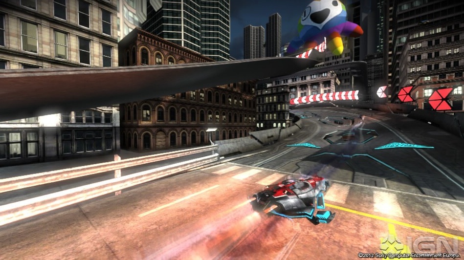
There’s no doubt that the power of the hardware is what really gives this game the ability to shine as it runs at a blistering 60 frames per second. Also, speaking of blistering, this game has an incredible sense of speed. You’ll hit the wall all the time at first, but that’s not so much because you’ll suck at the beginning as much as it is because you’re going so damn fast. If it was easier, it just wouldn’t be as much fun.
Now, this is clearly a game set in the future. But the designers at Studio Liverpool haven’t gone grey and silver with the colours as you might expect from every other vision of the future ever imagined. Graphics are instead bright and beautiful and glowy. Yes, glowy. Because these colours are so awesome, they deserve their own word.
Even the menu system is gorgeous. It’s laid out on a pristine white background, dotted with little triangles, through which the levels emerge. It’s a tough concept to explain, but that’s because it’s so unique. Think of it as a hyper-minimalist version of the level select screen in StarFox 64. That’s really as close as you’ll get to imagining what it looks like.
What the level select screen really amounts to is a really interesting display of a progress system that I’ve never seen before and it has small touches in it that are intricate and subtle. For example, while not really functional, if you tilt the Vita, the menu screen will move slightly. Some race icons are larger than others, signalling their difficulty or importance. The final race in a series will always have a massive icon, with the rest being smaller variations. Touching your fingers on the screen will also cause some of the white triangles to emerge from their place, but in a weird pattern that sort of resembles where you’re placing your finger, but sort of not as well. Don’t ask me to explain it, just play it for yourself and you can tinker around with the menu all you want!
Getting into a race itself is a bit of an issue. Only because it can take so long; the load time for a single race can get close to a minute or so. In my rather non-scientific tests of load times, I never actually breached the sixty-second mark, but I got to 54 seconds, which is probably thirty longer than anyone should have to wait. On a portable game, and running from a solid-state card, that’s just too long.
But then you get into the game. And it’s stunning.
There are four main racing modes: Race, Combat, Time Attack, and Zone. Race should be pretty self-explanatory so I won’t bother detailing it for you here, Combat involves weaponry (as does Race mode) and attacking your fellow racers until you reach a certain number of points, and Time Attack makes you shoot for, you guessed it, the best time. Zone mode is something entirely unique to WipEout, although it’s not a new feature to this particular game. In WipEout Pure for the original PSP, Zone mode was super-minimalist, with no crowds or moving backgrounds, but rather a white and pretty barren track layout. In WipEout 2048, however, the same minimalist approach is taken, but with LSD-tripping, super-saturated colour schemes that dilate your retinas and make your brain believe unicorns are real. And it’s awesome.
So the point of Zone mode is actually to stay alive. Rather counterintuitive to what you might think a racing game is all about, you don’t actually control acceleration at all. In fact, you don’t even need to touch the R-button at all. Instead, you just navigate with your steering and what minimal effect your air brake has on your ship, and stay alive for as long as possible. There are no power-ups, no way to regenerate health, and to make things difficult, you speed up for every level you increase, which tends to happen every ten seconds or so. If you manage to last the entire ten seconds without so much as grazing a wall, you’ll earn back some health, but don’t count on being that lucky once you’re more than a few laps in. Either way, this is one of my favourite modes and seeing a slightly different take on it is certainly welcome.
The games graphical design is stunning, as I’ve mentioned, but this also makes its way to the HUD and other elements of the game. For example, as you bounce from wall to wall and become disoriented, the HUD overlay actually bounces with you as if you’re in a Paul Greengrass film. It’s a great way of enhancing the feeling of speed and treachery in the game, and the fact that it’s a portable device that can actually move makes it that much more realistic. I do wish that the current position marker was larger on the screen, however. It’s the same size as everything else displayed on screen and, in a game this fast, you need your eyes on the race as much as possible, so if it had been a little easier to glance at, it would’ve easily shaved a second or so off of actual race times. A minor gripe, but a gripe nonetheless.
There isn’t a ton of rear touch or even touchscreen elements in the main WipEout game, although the option is there to turn them on. Please don’t. Okay, fine, I’ll explain:
There are three types of controls. WipEout controls, the classic button layouts, are alright, but having to hold your finger on the X button to accelerate feels far less natural than the R-button. Racer controls is probably the best set, using the R-button as your accelerator, and mapping everything else to be pretty obvious: X to use your weapon, O to absorb its energy, and triangle to adjust viewing angles. The third, and worse set of controls, is undoubtedly the touch and tilt version. It is unfortunate but rather expected that touch and tilt controls just don’t work for a game of this speed. Unfortunately, they feel tacked on to take advantage of the new Vita hardware to the point that they’re nothing but a huge gimmick. You have to cover up the screen to fire your weapons, and if your touch isn’t exactly right, weapons don’t fire, which can more than easily cause you to lose time, or worse, the game. You also don’t actually have much control over acceleration which you need for games with as precise control as WipEout 2048.
The different brands of ships in the game also make you feel like the game has an actual living world beneath it. Of course, this is a racing game, so that is truly a difficult thing to achieve, but with companies like Feisar and Auricom, it makes you feel like it is so far into the future that, while brands still exist, they’re not Toyota or Volkswagen, but different companies making a clearly different product.
And these vehicles actually have remarkably different characteristics. Some have a ridiculous amount of brute strength behind them, while others are total speed demons. While I’m not a huge racing game fanatic to know precisely, I’ve never felt a real visceral difference between vehicle selections in this way before.
The music is a characteristic of any WipEout game that can’t really be ignored, and this one is no different. If you’re into the Deadmau5 thing, you’ll love the audio here, but if you’re not into the techno thing, you might want to lower the volume. You won’t really be playing these songs in your head when you’re done the game either way, but you should have a decent time listening to it while you play.
Online play is pretty interesting in that it doesn’t set you up in lobbies the way you might expect. Rather than single matches, there is actually sort of a story mode you progress through. They’re mainly objective-based, with tasks such as “shoot one other player” and “shoot these two specific players and don’t finish last in the race”. I’m still not entirely sure how you’re matched up with other players, but I’m pretty sure it isn’t based on skill-level; you’ll sometimes find yourself twenty seconds ahead of everyone, and sometimes you’ll be twenty seconds behind. It may just be whoever is online gets to join your game, but everything is handled quite seamlessly on their backend without any settings to adjust on your end. It’s not always the quickest way to get a game started, but there are far more people online in WipEout than I’ve noticed in any other portable game out there, so that has to be a clue to something working I think.
My last major gripe with the game is that, on the PlayStation Store, the title is $35.99 without any online functionality. You can buy a code to let you play online for ten bucks though, bringing your total to $46 before tax. Or you can go to the store and buy a physical card with the full game and an online code for $39.99. Don’t ask me why, but one of these things seems a far better deal if you even want to test the waters with online play. I’m not sure why they split it up, but the pricing between digital and physical games is already odd enough, so Sony could use to get their act together on this one. I guess, if you want to see the silver-lining, you could say that this breakdown means you can get the full game for four bucks cheaper if you buy it online and don’t want to play any multiplayer. I guess.
This isn’t something I say very often, but WipEout 2048 has an incredible amount of finesse to it, especially for the fast-paced game that it is. Graphically, I’ve never seen a single out of place pixel or any aliasing whatsoever on ships or tracks themselves. Now, the game goes by you so fast that you wouldn’t likely notice these details had they been out of place anyway, but if you pay attention, you won’t find any. Go ahead, try. WipEout 2048 is pure gold and my pick for the best PlayStation Vita title so far.

